27 Dec Keep your Logo Design Simple and Easy to Remember at a Glance
Logos are an important component of any business. However, there are many factors to consider when designing your own logo. This includes, among others, the symbols, color scheme, layouts, and fonts. All these will depend on how you want the essence of your brand captured and presented.
Simplicity is vital. Complicated logo designs may not fully or easily engage your target audience. Think about some of the most famous or successful brands. Most likely, companies like McDonald’s, Apple, Target, Volkswagen, etc. come to your mind. What’s common to all of them? Their logos are not just simple but easily recognized. And it’s not just the simplicity that makes their logo design memorable but also the relevance to what the respective companies represent.
The best-designed logos are not just unique, but simple, memorable, and appropriate for the target market and industry being served. If you’re interested to create your own logo, Looka has a beginner’s guide to designing logos, broken down into 5 steps that are easy to follow and understand. Having noted that, how can you keep your logo design simple and easy to remember?
Must be Recognizable and Memorable

The primary function of a logo design is to serve as a recognizable symbol; an icon that customers will easily recognize and associate with your brand or company. A simply designed logo allows for easy recognition and memory retention. A design that is not overdrawn but yet unique is easily recognizable and easily recalled.
And for your logo to be recognizable and memorable, it doesn’t necessarily have to display your product or service. The Virgin Atlantic logo, for instance, isn’t an airplane. Have you seen any major car manufacturer whose logo has a picture of a car? Similarly, have you ever seen a shoe manufacturer with a shoe logo?
Use Colors to Elicit Emotional Responses

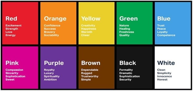
All logo designers appreciate the importance of color schemes for aesthetic reasons. However, the best designers also recognize that the role of color in logo designing goes beyond merely pleasing the eye. Besides being an important part of the aesthetic appeal of your logo, the colors chosen go a long way towards conveying the right kind of messages and eliciting the desired emotional responses.
As you select a color scheme for your logo, consider the type of message that a specific color is sending to your target audience. Do the colors strengthen, reinforce your core message and the brand personality you wanted to be communicated, or are they distracting or neutralizing?
Keep the Design Visually Balanced
In a logo design, balance is important because the mind naturally perceives a well-balanced design as being appealing and pleasing. All elements in your logo design should work harmoniously. They should be in the right proportions, color schemes, typography and a brand mark that just feels right. Use a typeface that reflects your brand’s attributes and personality, all presented in the right font. Reduce visual details unless they are contributing to your intended effect.
The critical questions to ask yourself are; what do you want to communicate? Can your brand message be read at small fonts/sizes? Is the word spacing/letter spacing in balance and well adjusted?? What can be added, or more importantly, what can be reduced? Is the overall logo design well-balanced?
Remember, the goal is to have a simple logo design that is easy to remember at a glance. A good logo design studio can help you achieve this.
Ensure Appropriateness
The logo must speak to people in a powerful way that makes them not only sit up, but take notice. For that, your logo design must be appropriate to what your business is offering. A logo of a mermaid, for example, would certainly not be suitable for an undertaker’s company.
Appropriately designed logos are really memorable and stand out. For example, if you are running a kid’s toy shop, a child-like color scheme and font would be very appropriate but such would not be suitable for your law firm.
Research the Competition
Knowing trends in the industry is crucial when you want to design a logo that remains ever-green. To follow trends, however, comes with an element of risk. Your logo design can be up-to-date and very modern but tomorrow, it can become pretty rusty.
Looking at the competition may inspire you in terms of getting a better feel of what the specific industry is using, the current trend. It can also help you in formulating a strategy towards making your design simple enough to stand out from your rivals.
Researching competing companies and keeping tabs on trends should only be used as a guide.
Conclusion
During logo designing, one is often tempted to go overboard in terms of colors, intricate fonts, and complicated design elements. This is understandable considering that every designer wants to create a truly remarkable, one-of-a-kind logo. However, when it comes to designing a logo, it’s usually advisable to keep it simple. Simple is easy to remember at a glance!
Keep it simple, stupid!


Dennis
Posted at 04:01h, 16 JanuaryThanks a lot for sharing this wonderful Content. It is really very amazing and interesting to design the logo alone after reading this informative content.