01 Apr 21+ Best Website Header Designs Inspiration for you
The header is the first part of the interaction, and luckily, because of the advancement of HTML and CSS specifications, we now have a lot of header designs to choose from. Here, I am adding a compilation of the best website header design inspiration for you.
This guide will help designers gain certain ideas about how they can create a unique header design and get the first interaction part of a website to look good.
A header plays a major role in web design and sets the tone for different aspects of the website. With the current minimalism era that we are living in today, where different eye candies get ruthlessly yet fairly dismissed. At times there is nothing much left for the eye to see? As a result, the header design is significantly important because it also plays a role in the website’s attractiveness.
Web designers and developers put a lot of effort into designing this aspect of a website with productivity and creativity in mind, according to a top New York web design agency any know for digital marketing. About Google, it only takes 50 ms to form an opinion regarding a website, and other opinions usually develop within a stunning 17ms. A customer’s acquaintance with your business starts here.
Table of Contents
Website Header Designs?
A website header is typically the top section of your webpage top section. A few years back, many people thought headers were the narrow strips at the topmost part of your websites that comprise contact information, a call to action, and a logo. However, with the new website header designs, the entire space over the homepage is usually considered the header.
As a strategic section of the web page that people first see in the first few seconds of the website loading, the header functions as some form of invitation. It ought to offer the most basic information regarding the site so that users can properly understand exactly what it offers in only a few seconds.
Many designers make different headers for different sections of their websites. For instance, you can create a larger header for the homepage and leave the smaller strip for other web pages. The most important thing that you should do is always to ensure that it’s consistent. Always keep in mind that the header design on the innermost pages should be the header’s abbreviated versions on the main web page. This is one of the best practices when it comes to website design.
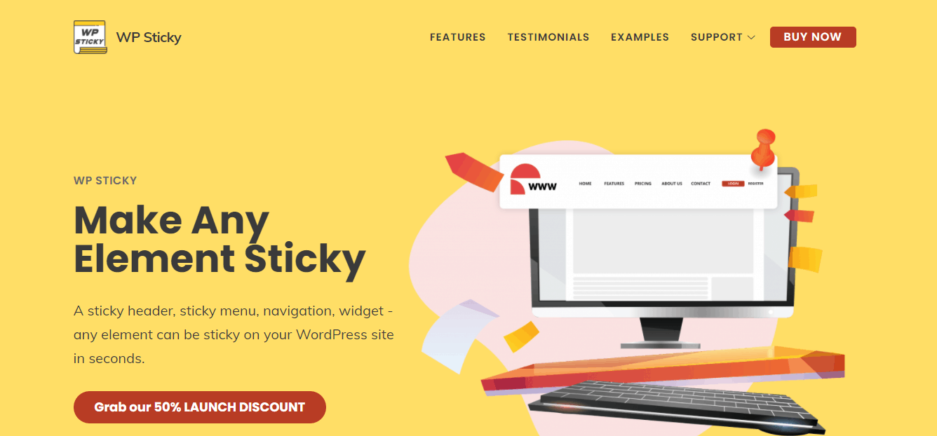
A great way to highlight your header and keep it within reach at all times is by making it remain fixed on the page while a visitor is browsing the website. When you stick an element on the page, you ensure it will always be in the user’s line of sight. When you make your header sticky, you can be sure that visitors will remember your website since its name will always be easily visible. A great plugin that can help you to make your header sticky is WP Sticky.
WP Sticky can make however many elements sticky as you want without being limited to a certain number. You can customize their opaqueness, position on the page, and more. You don’t need to know how to code; just choose an element you want, and it will become sticky.
WP Sticky is straightforward to use, and it will take just a few clicks to get your header set up and ready to go. It is compatible with all themes, page builders, and plugins, so you can use it carefree.
What Does A Website Header Include?
The work of a website header is to offer users valid answers in regards to the most fundamental questions: which brand is represented, what services or goods are offered, how you contact the company’s employees, are there any great deals, and much more.
Besides this, it represents the identity and quality of a website. For example, if the header evokes the best emotional response and the viewer feels that it has something great to offer, it has likely passed the first test.
The primary elements of the website header designs include:
- Search
- Navigational elements
- Headline or text
- Call to action
- Brand or logo identifier
It is also important to know that you don’t have to add all these at once. It is always important to find a great balance between informational abundance and harmonious arrangement. You should only use the essential data primarily because overloading the header will not be beneficial to your website, regardless of how important the links might seem.
Nevertheless, leaving the header empty is not the best idea. Users who cannot navigate around your website within a short time will possibly leave the page without ever coming back. This means that a bad header can easily push people to your website away from other websites with inferior content.
When it comes to the minimalist website header design, only links to major sections of the page and your company logo are presented. This method is more important when designing your website’s landing pages.
You need to start taking many notes about the design attempts that look unique and pleasing to you. Also, make sure that these website header designs are also niche-specific. So, one header that is working well for a website may not work in another case.
So, keep all these things in mind. Here is the list.

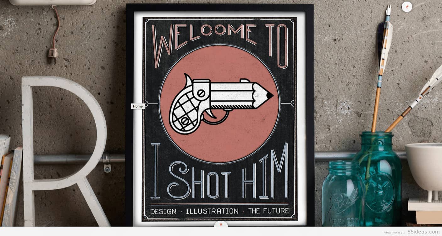
This is one of the most engaging websites I have seen in some time. When you hover over the box image, you get a custom message in the text box giving more information regarding the image. It’s unusual to see a the header section of a site layout like this. To me, it works well let me know your thoughts below.
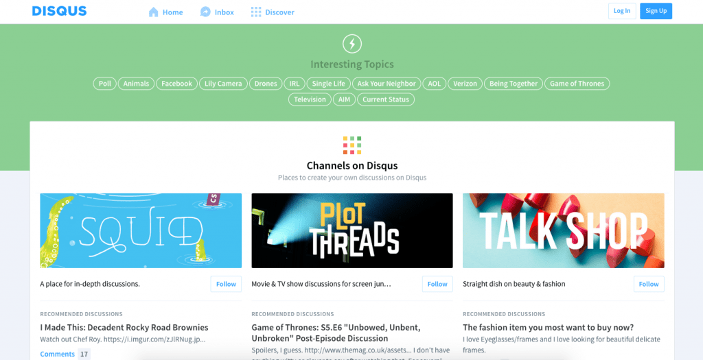
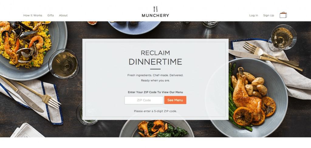
These types of header layout is one of my personal favourites because it features a clear call to action. Upon landing on Munchery, you get a clear idea of what the site is about. If you sell anything online or want your visitors to take action, then this type of layout might be suited.
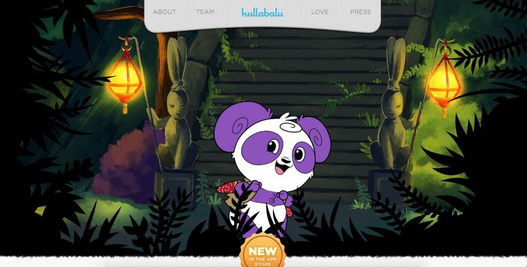
Coinbase

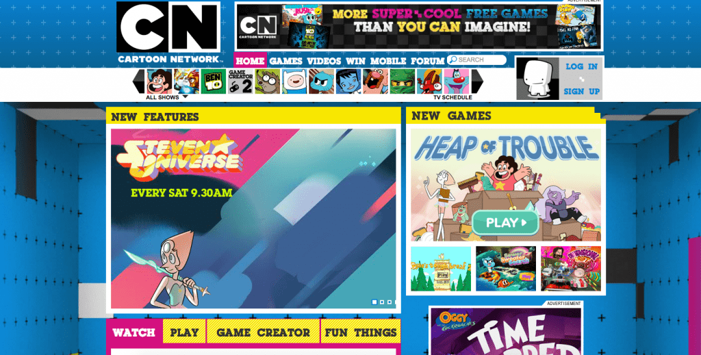
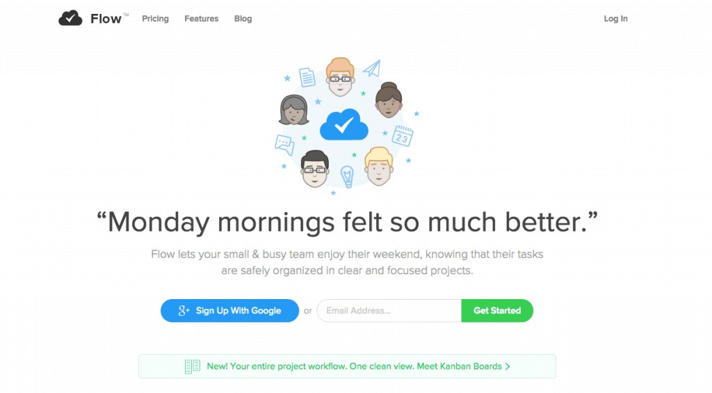
Flow designs is on the minimalist side, and although it clearly translates what the site is about, a lick of paint would have worked wonders.
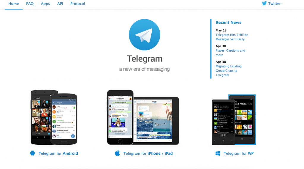
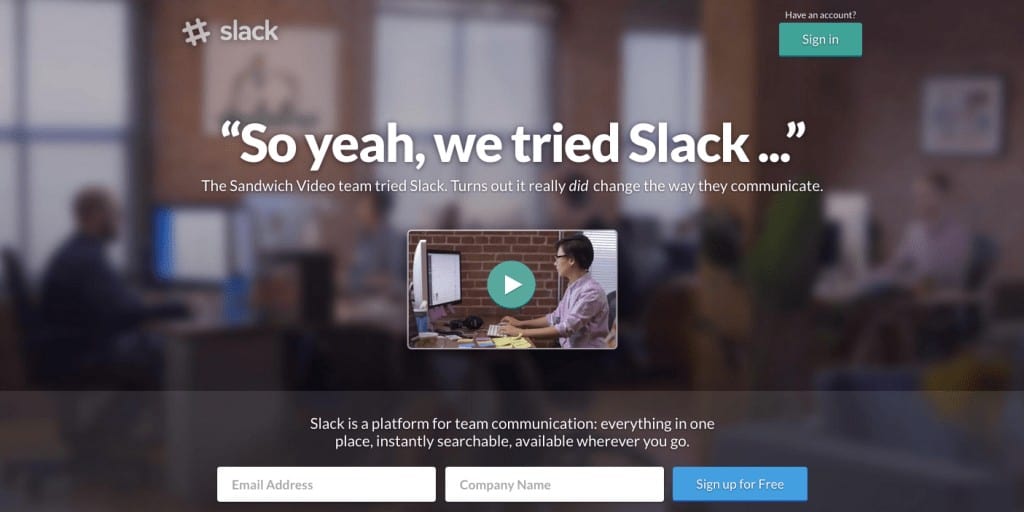
Slack features a minimalist design but unlike flow it showcase a more elegant design while keeping everything clutter free. From the screenshot above you can also see that it also features a nice call to action coupled with a short paragraph of what Slack is about.
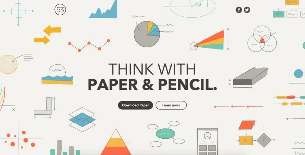
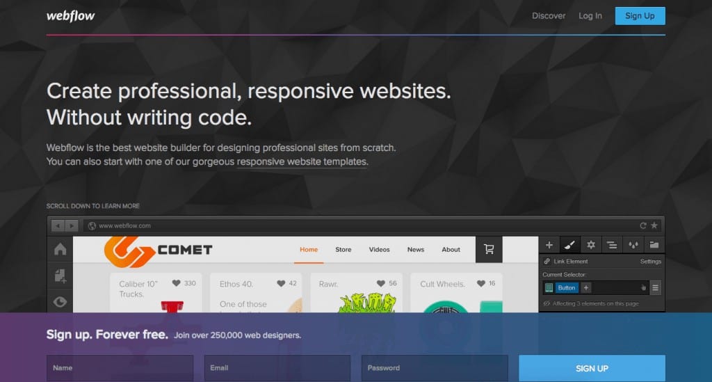
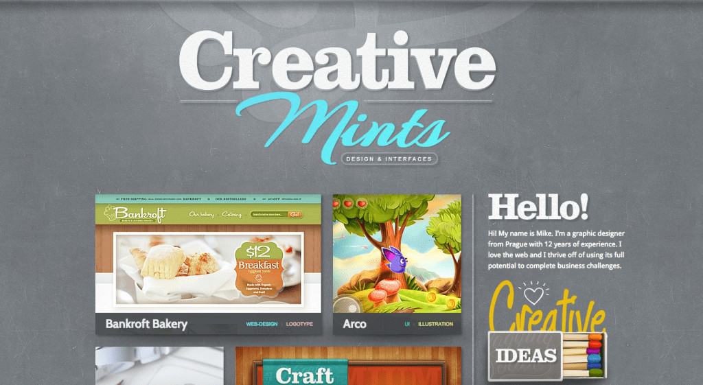
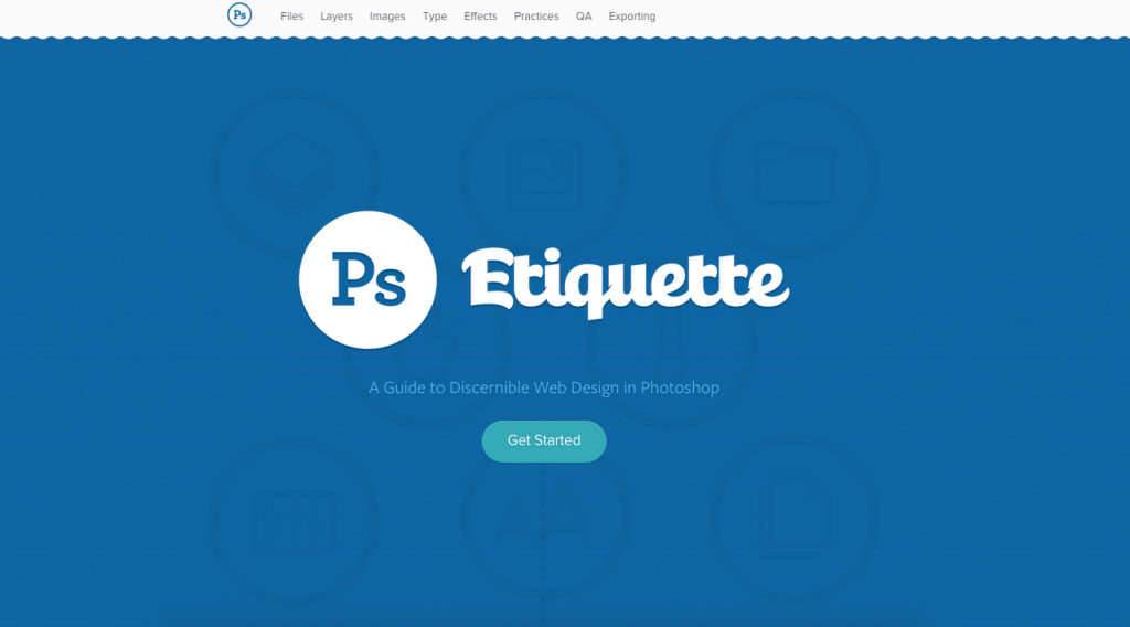
This header layout looks great however it does say much about what the actual site is about.
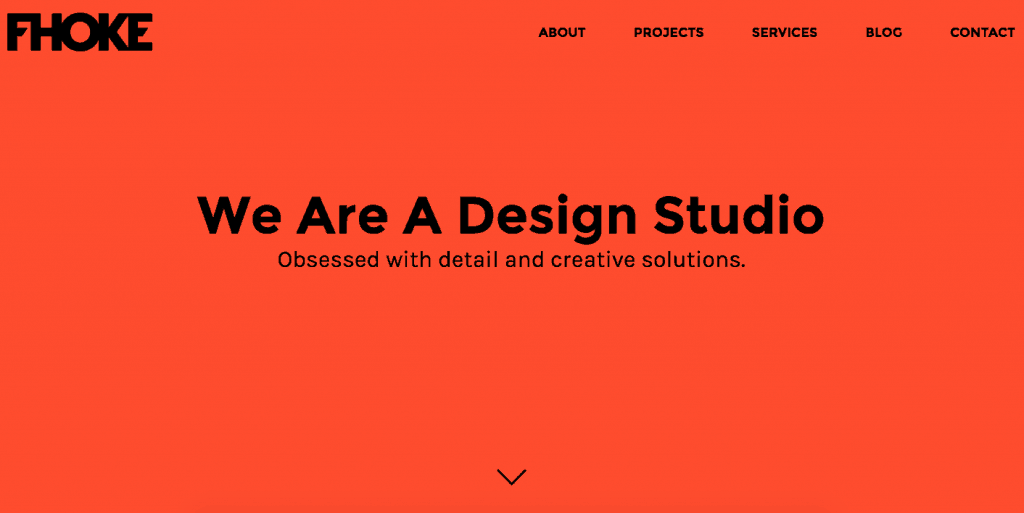
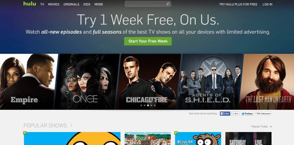
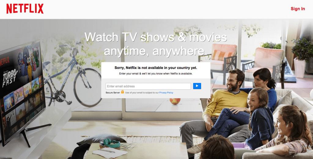
Netflix’s is another great example of how to design a webpage header. Everything on the page is in sync and clear inform you on what the site is about. There is no item menu to distract you which focus you on the call to action box.
I Shot Him
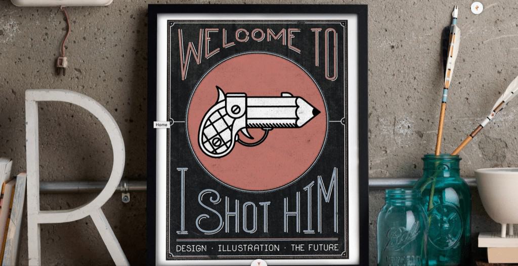
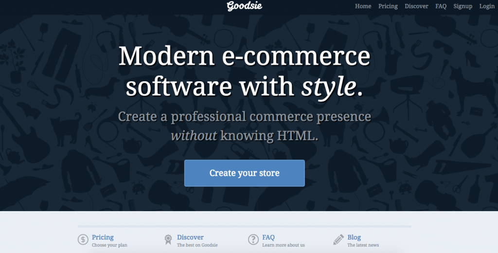
Goodsie

Wrapping up.
So there you have it a roundup of some amazing website header designs on the web. After hours of research, please let us know which was your favorite or if we missed ou any? Just putting this compilation together as I started to fill my mind with inspiration and ideas for my personal blog. The header usually presents a website. You can think of it as a unique company card. So, as you design your website, you should focus on the header.
As one of the best practices when it comes to designing your website’s header, you should consider making regular modifications to make sure your website is up to date and fresh.



chetan thakur
Posted at 08:07h, 10 Maynice collections its very useful for me for making my website header thanks pawan.