
19 Nov 10+ Contact Pages with Great User-Experience
Contact Pages are an integral part of a website;
they are as important as the ‘about’ or landing pages of a website.
Although sometimes they are neglected,
a good contact page can leave a huge impact on visitors and compel them to get interested in your site.
Contact pages should have a great user-experience because, as a website owner or a business owner, you want people to contact you. If the page is not user-friendly and the visitor, potential client finds it difficult, you might lose out on a wonderful opportunity. You are also likely to receive a lot of suggestions, feedback and business opportunities if people find it easy to contact you.
Chances are that your visitors will only land on your contact page when they’re impressed with the website design and your service, but a great contact page helps build a positive brand image. Contact pages should be compelling enough for the visitors to fill the form or pick up the phone and give a call.
We also recommend reading:
- 10+ Free Contact Form Plugins for WordPress
- 7+ WordPress Plugins to Gather User Feedback
- 7 Best WordPress Poll/Survey Plugins of 2015
We will show you some of the best user-friendly contact pages that we’ve found on the web for you to get some inspiration. I have compiled a list of 10+ best Contact pages showcasing great user-experience.
Table of Contents
Mostly Serious
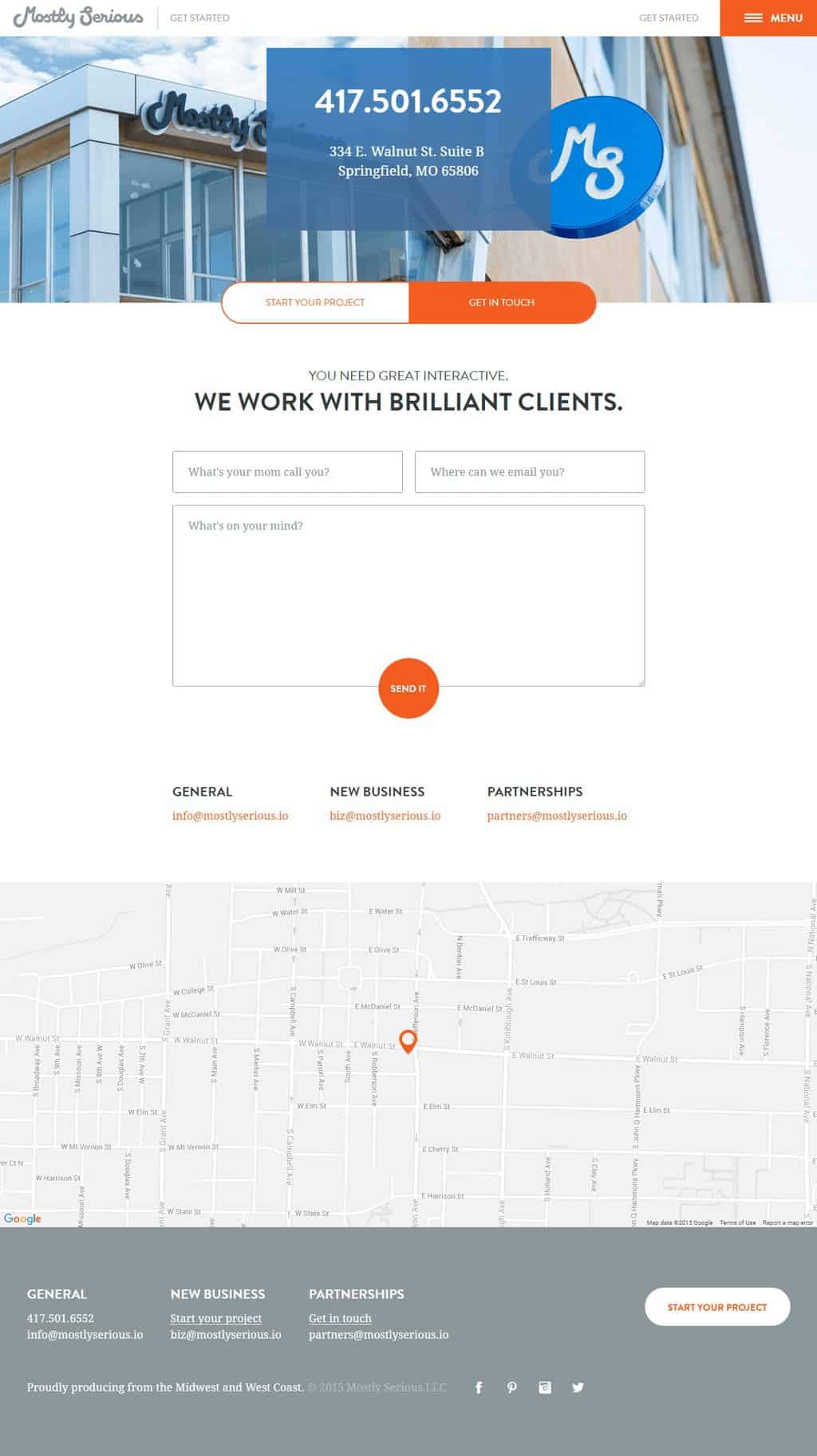
Their contact page has the right blend of professional outlook as well as informal approach. They have kept it minimal yet giving out all the necessary details and an opportunity for the visitors to cough up as much information as possible. The number of fields to fill in details is less, just the name, email and message and I like that they have replaced ‘send it’ with the usual ‘submit’ message on the button.
Music City Unsigned
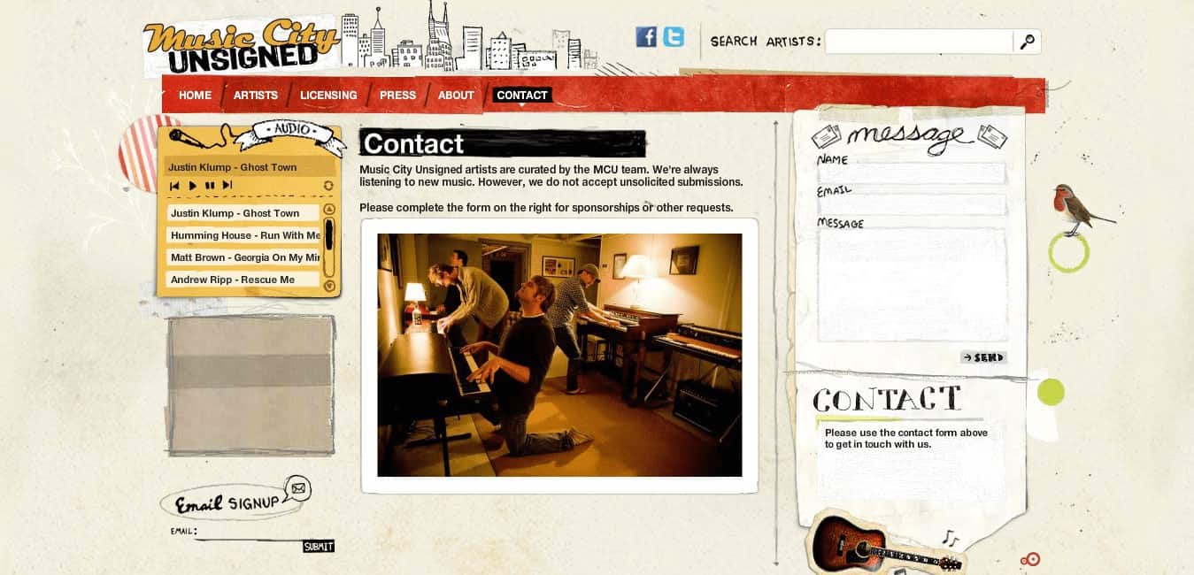
Music City Unsigned has an informal and quirky contact page with an easily convenient contact form. The layout and the design are impressive with the feel of handwritten font makes it visually appealing. The best part about the contact page of this website is that it has a high quality picture of the team that gives a good vibe to the visitor.
Full Details
Code Quest
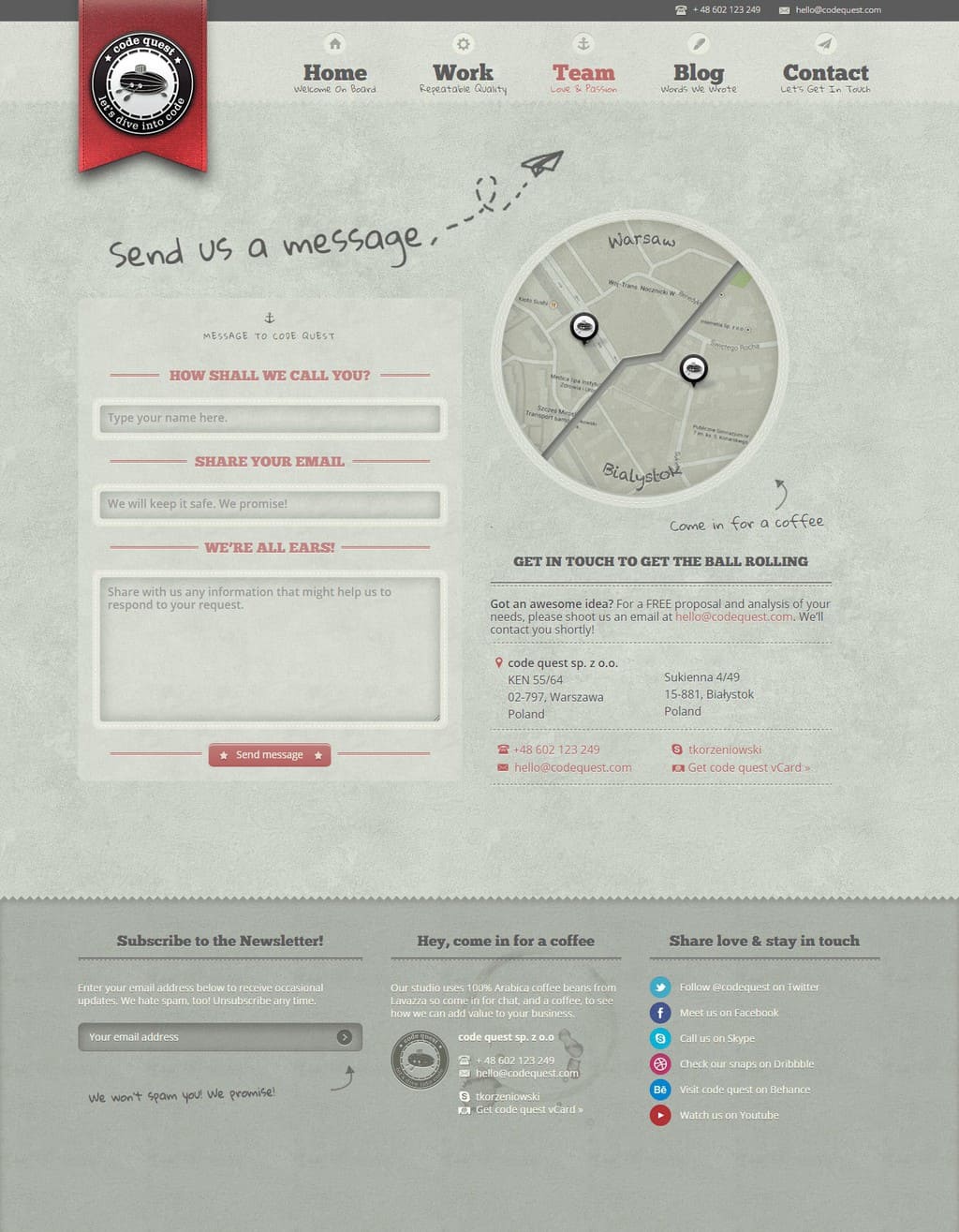
Code Quest is one of my favorite designs from the list, it gives a great user-experience and leaves the user mesmerized with the design. A lot of attention has been given in the design process of the website and contact page is not an exception. It has all the necessary elements of the contact page; they also have a map with a personal invite for a cup of coffee. They have interesting texts in the information fields, clearly a good way to build an everlasting first impression.
Online Department Rotterdam
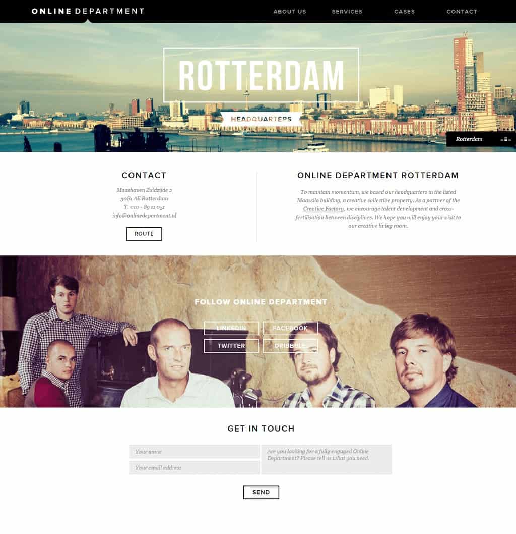
The contact page of the online department Rotterdam is impressive with its scrolling option. It is unique, and each section of the contact page contains different information, apart from the regular links, it also has dribble link. The brilliant contrast of images and text has made the contact page more interesting.
Fior Di Latte
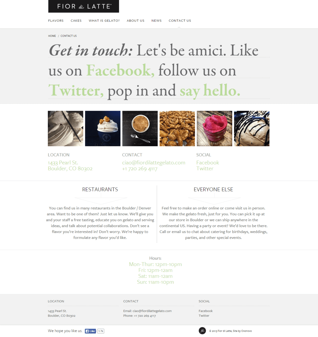
They know the power of social media and don’t want to leave out a single opportunity to connect with their visitors. Fior Di Latte has an unusual contact page, they use their contact page to engage with their visitors and it works for them. It has an appealing design with a call to action in bold and colorful types and some inviting photographs to catch the visitor’s attention.
Built By Buffalo
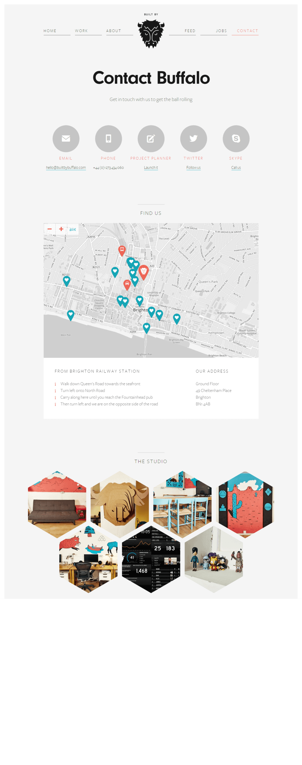
This is a carefully designed contact page with clean and minimalistic design that does the needful without any mess. The page gives out a lot of options to reach out to them, including a map with directions, yet they have managed to keep the page devoid of unnecessary clutter. They have also included pictures of the workplace; this user gets every information about them from the contact page.
Let’s Travel Somewhere
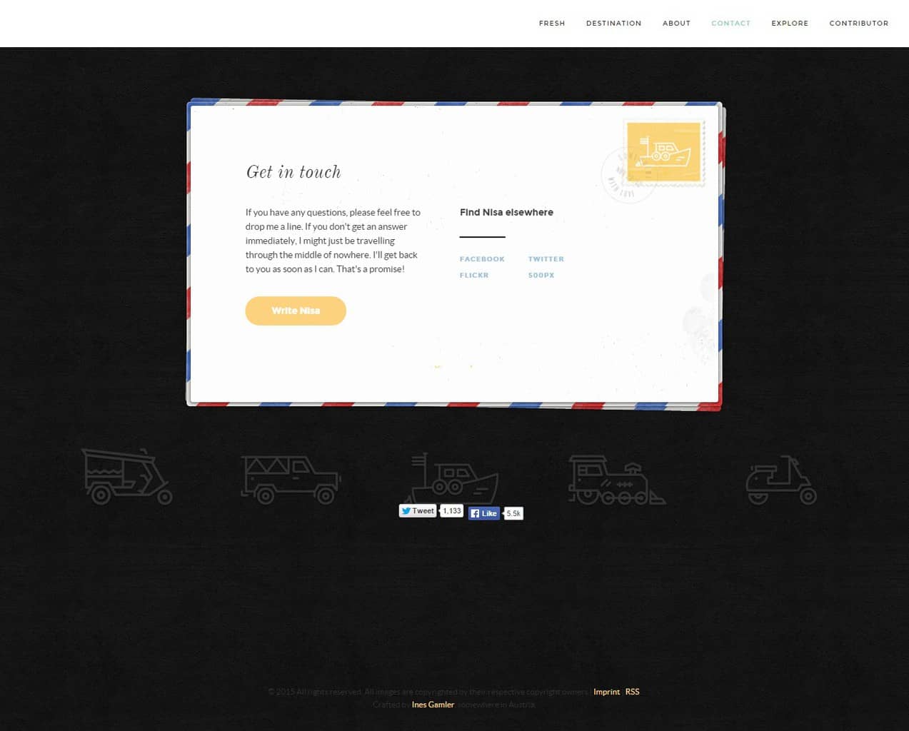
The postcard on a website that is associated with travel photography and travel stories makes great sense. It instantly strikes a chord with the visitor and makes them want to interact with them. The design is clean with the focus right on the call to action text. Apart from that, they have included the social media icons right on the postcard to get the visitor’s attention and engage them. After all, social media interaction is as important as the website visits if not more.
HUMAAN
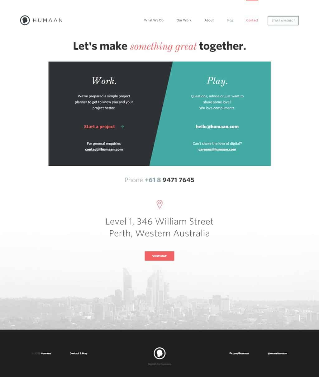
This is a quite creative contact page, good use of color and space to send the message across. The design is befitting to a creative agency; they have clear messages to their visitors. The slogan gives a positive feel, and they have beautifully presented their perfect blend of work and play on their contact page. The user will identify will the contact page as it gives a very personal experience and will love to contact the team.
Lander
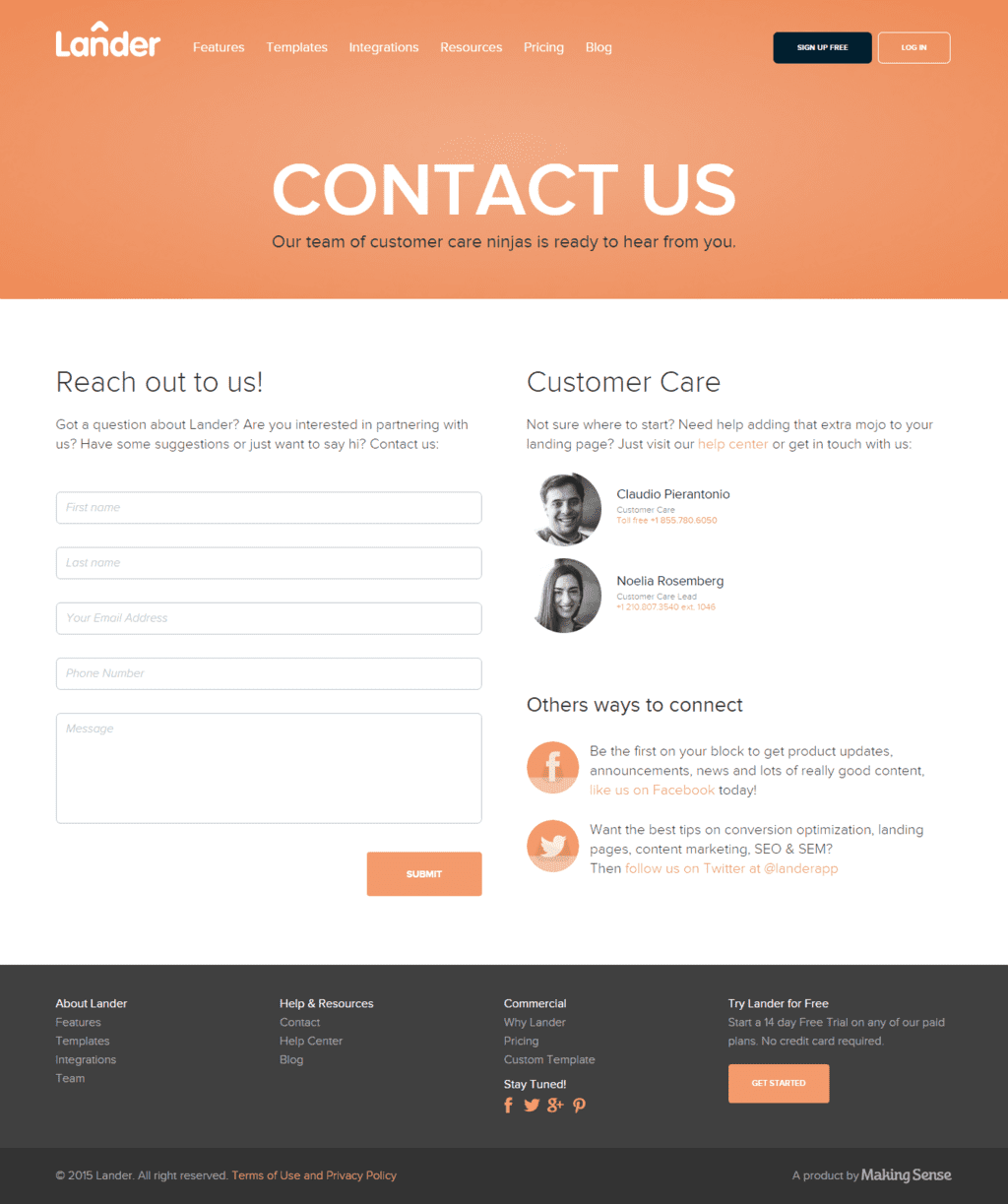
The contact page of this website has a personal touch to it, instantly making the visitors comfortable. The use of soft colors, clean design, gives it a professional outlook. The fact that they have included pictures of the customer care folks that you will speak to if you ring them up makes them unique and cool. They have social media buttons if you want to reach out to them through these networks.
Invision
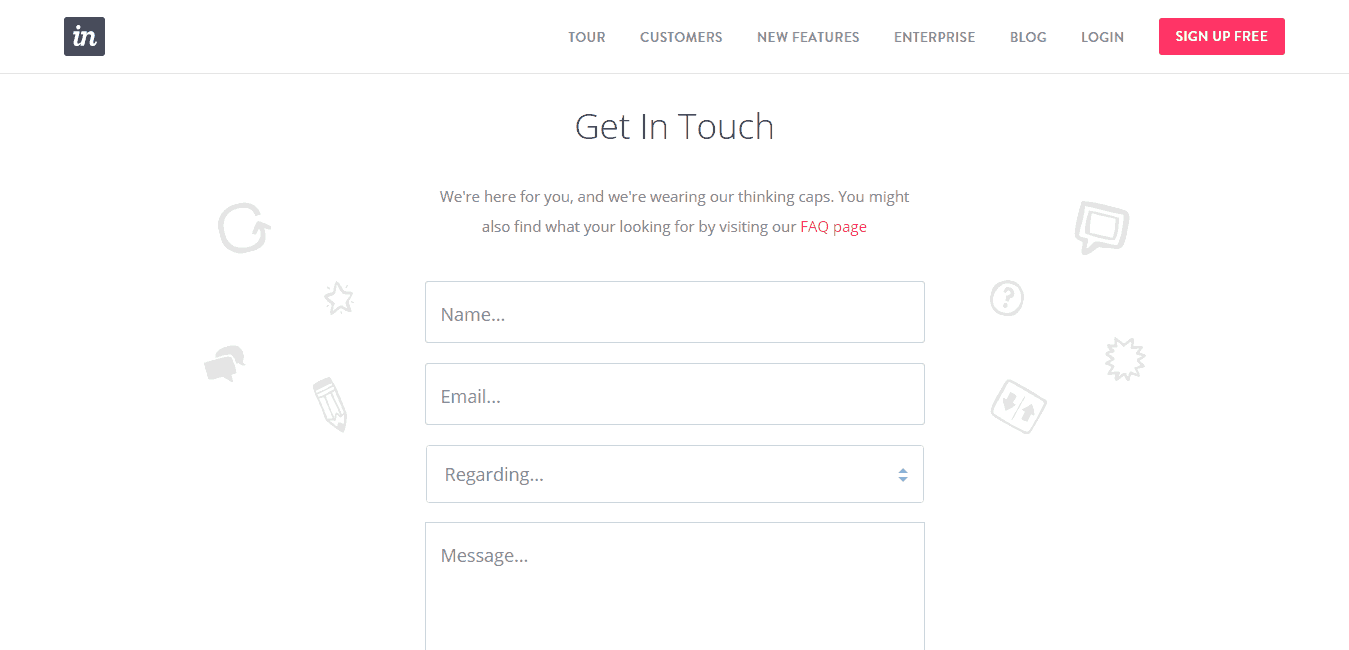
This is an utterly simple contact page that allows the visitors to focus on the purpose and fill out the form without wasting time on anything else on the page. They believe in the idea of ‘Less is More’ and have implemented that very well. The simplicity of the design gives it a professional look, and it manages to engage the users easily.
Wrapping Up
We hope that you find the list useful, the compilation is based on the essential components, design, quirkiness and other useful elements. Feel free to share any contact page that stands out and has an exceptional user-experience, we would love to include it in the list. We would like to hear from you about our efforts, feel free to drop in your suggestions and feedback.
If you like our effort, don’t forget to hit the share button and show us your support!



Dani
Posted at 16:00h, 01 SeptemberI love 85ideas.com
I think it’s a great site!