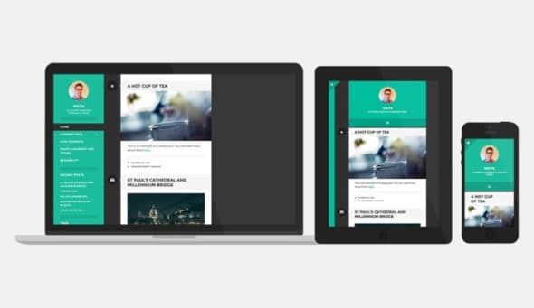
26 May Awesome Tips to Make your WordPress Site Mobile Friendly
Nowadays, most people are using smart phones to search for anything online, check their mails and social media networks or catch up on their reading. According to official Google statements, more than 50% of all searches online come from mobile devices. A mobile friendly site appears like a small version of your regular site. In order to make your website look amazing on mobile phones, you’ll need to optimize every element on your site to respond to the screen size. Also, if you want to attract and retain traffic, you must ensure that your WordPress site is fast loading, especially on mobile phones.
Why should your WP site be mobile friendly?
- Mobile friendliness is considered as an important ranking factor by search engines. It is usually determined in a page by page basis, which means that the mobile friendly areas of your site will rank higher, while the remaining content of your website will rank lower.
- As previously mentioned, more than 50% of internet searches come from mobile phones. A website that is not so easy to browse may result in a higher bounce rate, which can seriously hurt your website’s SEO. In contrast, a webpage which is mobile friendly can result into better SEO and site speed.
Nowadays, many WordPress themes are fully responsive and may display your site on any device. In addition to a mobile friendly theme, you can also do a couple of things in order to optimize your website for mobile devices. Below in this article you can find a few simple tips on how to make your WP website mobile friendly:
- Choose a Mobile Friendly WordPress Theme for your website
While there are tons of free and premium themes for your WP site, if you want to make your website mobile friendly, it is wise to choose a mobile friendly theme.
You can check out the article: The Best AMP – Friendly WordPress Themes, and choose the perfect theme which will suit your website’s needs and requirements.

- Use a mobile first approach
The mobile first approach creates a unique UX design especially for mobile devices by prioritizing content strategy for tiny screen size.
The other important reason to use first mobile approach is the announcement by Google saying to shift gradually to a mobile first indexing. The method of indexing involves Google checking first the website’s mobile pages for indexing, and then the desktop pages. When selecting a website for the Mobile First Index, Google usually uses so called classifiers in order to find out if the site is ready for the mobile first index. The classifiers determine how comparable or equal the desktop website is to mobile site, when it comes to links, content, multimedia, schema, etc.
- Implement AMP (Accelerated Mobile Pages)
AMP is Google’s open source initiative, which provides fast loading content on mobile devices. Accelerated Mobile Pages gives publishers the needed means to create mobile friendly content once, and then have it load instantly everywhere on mobile devices.

AMP is still not a ranking factor. However, it can have a great impact on SEO and a positive user experience.
- Optimize your Images
In order to make your WP website mobile friendly, you’ll need to optimize your images to fit tiny mobile screens. Since WordPress 4.4 version usually takes care of this, you can also use a WP plugin, in order to optimize images.
Keeping in mind that optimizing images requires a balance between page performance, visual appeal and user experience, you can do much more to optimize your images. First of all, you’ll need to remove the images that do not add value. Then, before you upload the images, be sure to optimize them by compressing the same to smaller file sizes. The WPSmush and TinyPNG online tools may efficiently do the job for you.
- Avoid Spammy and Hard to Dismiss Full Screen Popups
Popups really work, there is no doubt there. Anyhow, while using full screen popups, you need to always keep in mind user experience. Popups which are relevant to the content and offer real value to the visitor, have a better shot at conversation. On the other hand, spammy and hard to dismiss popups which display ads all over the main content will surely send away your visitors.
When a visitor clicks on your page trough Google, your content must be readily available. Popups which are in response to legal obligations, such as small ads which are easily dismissible, login dialogs that allow access to some locked in content, or age and cookies confirmations, are totally fine with Google.

On the other hand, popups which appear as soon as the reader opens your page, and entirely cover the main content, do not favor as much with Google.
It is smart for you to use only small popups, like banners, slide ins or inkiness which are easily dismissible, so your visitors may have a pleasant experience while visiting your website.
_
Thank you very much for reading this article. Today we presented some easy tips to make your WP site mobile friendly. We hope you found this article helpful. If you need any additional help from us, or have any questions what so ever, please do not hesitate to contact us below in comments, and we will do our best to help you as soon as possible.


No Comments