
14 Sep The Ultimate Guide to Creating Effective Social Media Landing Pages
Social media landing pages are necessary conversion tools for social media campaigns. They’re laser-focused to attract the right customers to you. I’ll put this into perspective in a bit.
There are over 7 billion people in the world today. Out of that, 4.48 billion are active on social media. In case you missed it, that’s more than half of the world’s population.
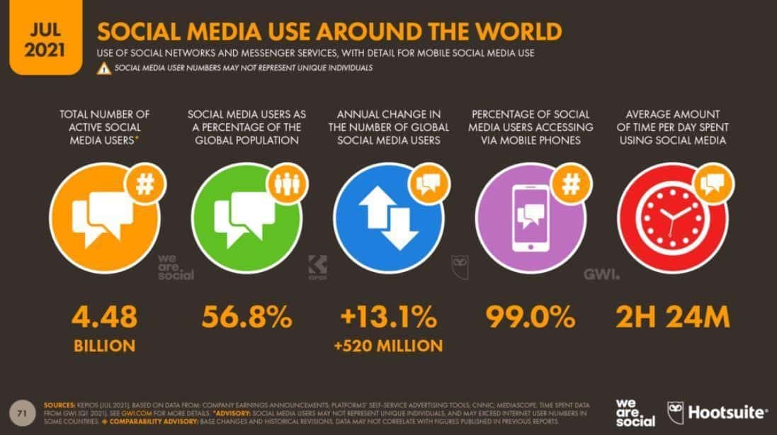
Source: Datareportal
What value does this statistic hold? Social media is a huge market. That’s why companies don’t mind spending top dollars on social media sponsored ads. But here’s the thing, with sponsored ads—or any other ads for that matter—you can’t target half the world’s population.
The most you can do is target a select audience and hope they convert into paying customers. As far as social media campaigns go, engagements and conversions are imperative for your business’ success. But these aside, you’ll need a social media landing page that spurs your audience to action—that’s how they come to you.
This article will explore practical steps to creating and optimizing successful social media landing pages for your businesses.
Table of Contents
What Is a Social Media Landing Page
Social media landing pages are destination pages for social media campaigns. Visitors land on these pages following an embedded link in a promotional or organic social media campaign.
These landing pages could be a linking page to your online store or even a lead capture to your marketing funnels, depending on your social media campaign.
Either way, social media landing pages are simple, captivating, and laser-focused to attract the right kind of customer using clear calls-to-action like: “Buy Now,” “Register Now,” “Send a Message,” or “Shop Now.” These targeted actions make it easy to customize these pages for specific social campaigns on social media.
Now that’s out of the way, let’s get into the nitty-gritty of why you need a social media landing page and how to create one from scratch.
Why Do You Need a Social Media Landing Page
Social landing pages direct the right customers to you, as we discussed earlier. But that’s not the only reason you should create one. When you use generic landing pages for your social media campaign, you risk getting your visitors distracted or have lost interest along the way.
How? Most times, generic landing pages do not align with specific campaigns, leading to a lower conversion rate. Imagine stumbling on a sponsored ad on Instagram for a new line of sports shoes, but the landing page leads to a major product category that shows the entire gym collection—and not a single sports shoe in sight.
What would you do? At this point, there are likely going to be two outcomes.
One: You could browse through their collection till you find a sports shoe that fits. Or wear yourself out, and bounce.
Two: You won’t bother at all.
I mean, what’s the point, right? You probably had other things you were doing before stumbling on that ad. Great. Now, flip the narrative. That’s precisely why you need social media landing pages!
Aesthetics and conversions aside, it shortens the timespan spent searching for certain products and services on your eCommerce store. Add that to consolidating your social proof on the same landing page, and you can shoot up conversions.
Since some visitors are likely to be encountering your page for the first time, they’d need an external influence to spur them to action. Again, that’ll depend on how you design and optimize your landing page.
Take a look at these examples below created using a landing page builder. You’ll notice that they have fundamentally different objectives. For example, the first sample has a customer review, and the other does not.
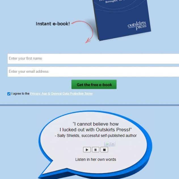
Source: Outskirts Press
Outskirts Press, a self-publishing agency, is really big on saying more with fewer words. Their landing page outlay is simple, and a customer review is enough social proof to spur a new visitor to action.
The landing page below by The Motley Fool has more copy on the page. This, however, doesn’t make the first example a better landing page. Like I’d pointed out, their campaign objectives could be inherently different.

Source: The Motley Fool
From these examples, you can see that these pages serve to encourage users to take action immediately and not “browse through.” But whatever the case may be, creating a social media landing page is not a one-size-fits-all; your campaign objective might influence the design and optimization.
If you think of it this way, you’d realize that social landing pages do more than attract customers. They help you highlight your campaign’s latest offer and ensure you assess its success by tracking conversion metrics such as purchases, click-throughs, and bounce rate.
You can hire professionals to help with this, or even take user experience certificate classes or programs to handle it yourself, but that’s not always a realistic option for everyone. That said, let’s help you roll out an effective social media landing page with these tips below.
Five Tips to Help You Create a Successful Social Media Landing Page
With social media landing pages, you have the creative license to design your landing pages to taste. In reality, this doesn’t always guarantee success, as the average landing page conversion rate is 2.35 percent.
But don’t sweat it. You can still break into the top 10 percent with a few tricks and tips up your sleeves and gradually ramp up your campaign conversion rates and overall success.
Here’s what to do.
1. Include a Strong Call-to-Action (CTA)
Social media is a busy place. Anyone can get swarmed or swooped up in the wave of too many sponsored ads and other social media posts. Why, with over 4 billion people on social media, everyone has something to say, and that includes you.
Therefore, since your visitor has made it through by clicking your campaign link, the least you could do is ensure they don’t second guess how they landed there in the first place.
The only way to achieve that right off the bat is through a CTA. Aim for a strong and compelling CTA like this one by Wall Street Journal.
 The CTA reads, “Learn More.” Wall Street Journal employed a concise way to encourage visitors to click through. That aside, do you also notice the simplicity of the landing page? Visitors cannot focus on the copy and head straight to the CTA without distracting colors.
Design your landing page to follow best practices like these, but while you’re at it, stick to one CTA per landing page. If you have multiple campaign objectives, consider creating unique landing pages for each, as multiple offers on one landing page could drastically drop conversions.
Also, ensure your headlines are persuasive and compliment the CTA. Your goal here should be more conversion rates with fewer words, so visitors don’t get confused or distracted along the way.
2. Maintain a Consistent Brand Message
There are various channels to reach out to the consumer, from email sequences to social media. While the channel may be different, consumers look for a consistent experience across brand voice, identity, and messaging. It could affect your conversion rates when they can’t relate to it.
There are many ways to regulate brand consistency. For instance, if you were dealing with a content marketing campaign, you could create an editorial guideline for your website content like blog posts.
However, social media is heavy on visuals. Hence, a consistent color scheme, combination, or palette will work best. Remember the Wall Street Journal sample above?
Here’s how the post-click landing page looks:
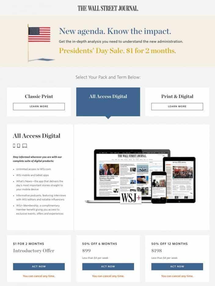
Source: Instapage
Notice there’s still the same white-black-blue color combination on this page in their Instagram landing page? That’s because they’re consistent with their message. The reason behind this is simple: they need their users to relate and feel comfortable with the brand.
Too many contrasting colors on your social media landing page will make it look tacky and unprofessional. Instead, consider taking a professional photo shoot of your products using a consistent background.
Thus, if you started with a visible purple and gold color tone on your Instagram, for example, you want the linked landing page to have a similar background.
However, that aside, consistency ensures your message remains the same across social media platforms. That way, even if you were re-purposing the landing page, your audience won’t get confused.
3. Focus on Mobile Devices
I’m sure you’ve noticed, but you tend to use social media on your mobile phone. You’re not alone. Approximately 99 percent of users access their social accounts on a mobile device rather than a laptop.
Since your target audience is probably on their phones each time they log in to social media, you must design and optimize your landing page for mobile marketing. By default, any landing page must have a responsive design. Your social media landing page must be “scrollable” for the best results.
Take a cue from this Conversific example below.
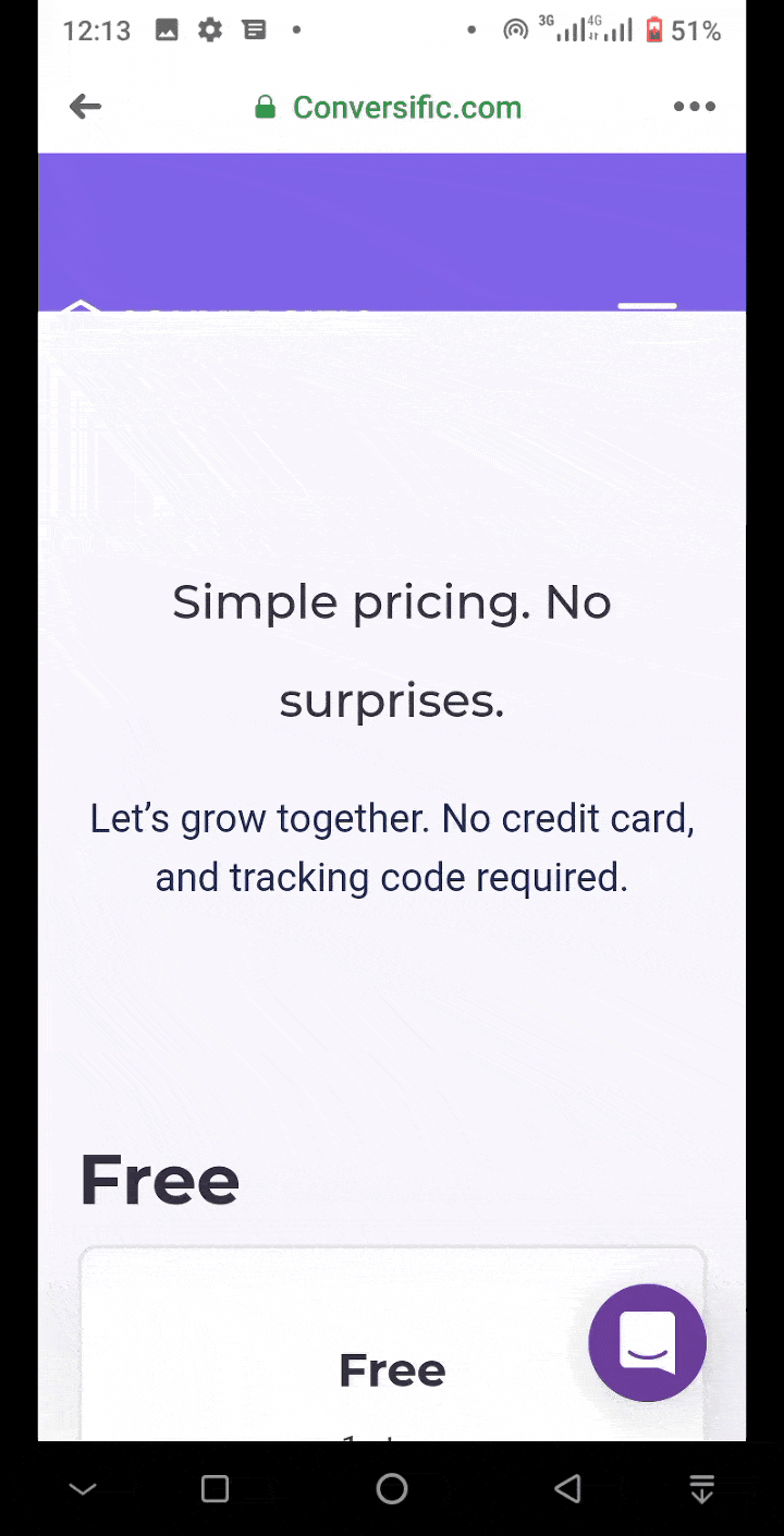 As you can see, the landing page design is well optimized for mobile by being scrollable and keeping all the elements visible at a glance. Visitors can navigate this landing page without mobile constraints, such as incompatible photos or missing fonts.
Whatever the objective of your social media campaign is—generate leads or sell products—ensure the landing pages are mobile-friendly, responsive, and accessible at a glance.
4. Create a Simple Page
The next thing to be mindful of is simplicity. When creating landing pages, it’s easy to go overboard with too many words or images. Amid all the social media brouhaha, you don’t need a busy landing page to add to all the noise. Your visitors might lose sight of what your campaign is all about, and this may hurt your conversion rates.
Again, I’ll put this into perspective using a couple of samples from the Dollar Shave Club. First, check out this sample Facebook ad from them:
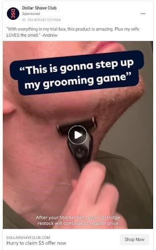 With “Shop Now” as the CTA for this social media campaign, there’s no mistaking the next course of action. When visitors click on the CTA, it brings them to a landing page that is as straightforward as they come.
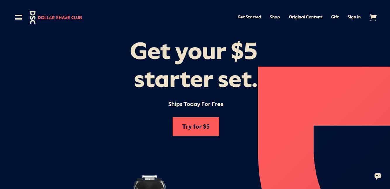
Source: Dollar Shave Club
The landing page above employs a minimalist design, where the copy and CTA stand out. They didn’t go overboard with colors, background designs, and font style, making it a superb example of a simple and effective eCommerce social media landing page.
And look! I checked out the same page on mobile, and there was no difference!
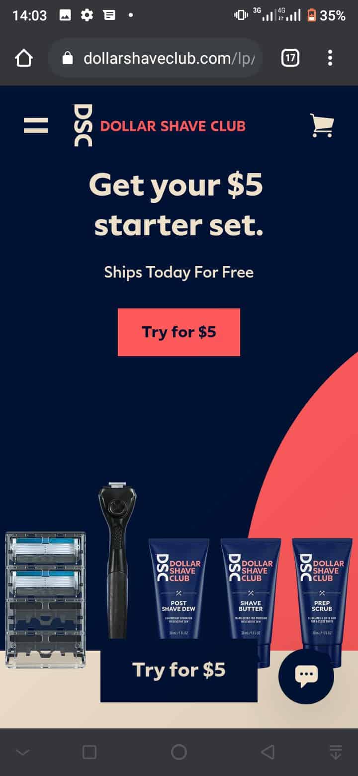 But of course, you can tell it was optimized for mobile by incorporating the exact fonts and design from the desktop page so that visitors can have the same landing page experience.
You could achieve the same results too. But you must aim for a decluttered space where images and words truly stand out and are catchy. Skip the lengthy copy, unnecessary buttons, contrasting colors, or anything that could be off-putting to new visitors.
Again, this is not a hard and fast rule, but stick to the basics like product name, social reviews, product photos, and CTA, so you don’t go overboard. In general, it is always a good idea to keep it simple when developing your website to ensure you don’t overwhelm the visitors.
5. Test Your Page
If you’ve judiciously followed the tips in this guide, your social media landing page should be gearing up for success. However, you’re not entirely out of the woods yet. Why? There’s always a possibility of something better! You could get higher conversion rates or re-target your ads to reach more people, for starters.
The key to this is simply trial and error. You need to keep at it till you find the best landing page formula for your business. Create multiple descriptions and product images, and switch them up to gauge audience reactions.
You could also experiment with different headlines, CTA, and color combinations for best results. Whichever you intend to go about it, record your progress, and keep at it until you find what ticks the box.
Wrapping Up
Social media landing pages are crucial for targeting customers and increasing conversion rates in social media marketing campaigns.
But to make it practical for your campaigns, you need to test and tweak them regularly. That way, you know what works best and leverage it as you go. A successful social media landing page follows best practices like clean and simple.
Keep your copy brief, concise, and straight to the point, as too much can get your visitors distracted, and too little might not be enough to spur action. Nonetheless, when you’re whipping up a new social media marketing campaign for your business, use the tips in the guide to get you closer to your conversion goal.

Ian Loew is a web entrepreneur and inbound marketing expert, and the Owner & Head of Business Development of Lform Design. After four years of helping Fortune 500 companies with MGT Design, Ian embarked on his freelance career before establishing Lform Design in 2005.
He leads a team of creative professionals to deliver inspired online experiences via modern, responsive websites that reflect his clients’ core values. When not at the helm, Ian can be found mountain biking with friends or spending time with his family.


No Comments